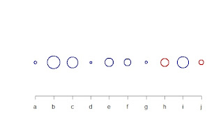
As an exercise in expanding my ability to display data I challenged myself to present 10 data points in 10 ways that were as distinct as possible. The idea was simple: use 10 random data points; minimize the axis and other ancillary information so as to focus on the data as much as possible; and try to minimize the overlap between each of the approaches.
Initially, I expected this would be a trivial task - something that would take a single sitting and a little bit of thought. A few attempts later and I kept circling back on a few common ideas while considering just how many approaches I'd not considered. What exists below is a collection of the results of that exercise with explanation if necessary.
1 - Standard Cartesian (scatterplot)
2 - Derivative Cartesian: uses labels instead of points to eliminate the need for tick marks on the x-axis.
3 - Impulses. Mixing the number and characters on the x-axis tick marks is questionable and could just as well have been labels at the top of each impulse
4 - Sorted derivative Cartesian
5 - Boxplot
6 - Barplot
7 - Radial. Points are interpreted as radians and placed starting from 0 radians
8 - Heatmap
9 - Cumulative Sum
10 - Financial/Intensity: Positive values are blue, negative are red. Absolute values define the radius of the circle used.
I considered others such as LOESS fit but they either needed the points to accompany them (to show what was being fitted) which made them too close to the Cartesian plot, or they were too complex for just 10 points.
It was interesting to see how difficult it turned out to be to stretch 10 points into 10 distinct presentation approaches.


No comments :
Post a Comment