Showing posts with label plots. Show all posts

Sunday, May 6, 2018

Affine Transformation

I've been working on a personal project for data presentation and exploration. It is very much a work in progress but as part of the development I've come across some interesting little technical problems to solve. I hope to eventually have a longer series of posts along the lines of 'building your own data tools;' however, until I find the time to give that the attention it needs, I plan on posting some smaller entries centered around these technical problems.

One of the early challenges I came across when plotting data was mapping the input values to the fixed amount of space I had on screen. For example, if I generate a window that is 600px wide I can only support a range of input values less than or equal to 600 (using a naive approach of each value in the range maps to a pixel on screen). Supporting an input range greater than 600 values requires some level of mapping between the input values and the available pixels on the screen. There are simple conversions for specific input ranges (e.g. when the range is close to a multiple of the number of pixels) but a more general solution is necessary to handle arbitrary input data sets.

The way I ended up solving this was to use an affine transformation to map the input domain to a fixed pixel range. This is how scales work in D3.js if you are familiar with that JavaScript library. For example, if my input values come from [-100, 100] but I need my output values to fall within [28,63] then applying this transformation would look something like the image below:


Notice that the minimum value in the input interval (-100) maps directly to the minimum value in the output interval (28). Values along the input interval are mapped to the output interval preserving the relative position within each. The equation to do this is:

\[ range_{x} = (domain_{x} - domain_{a}) * ((range_{b} - domain_{a}) / (domain_{b} - domain_{a})) + range_{a} \]

Where domain and range are defined by the intervals \([domain_{a}, domain_{b}]\) and \([range_{a},range_{b}]\), respectively. Neither the domain nor the range is required to have a 0 as one of the endpoints and the intervals can be either increasing or decreasing. This generality is helpful in a variety of contexts. For example:

Setting Borders
The viewport used to plot data may not always use all available pixels of the window; multi-plot windows or viewports that have a border are two examples. In the case where there is a border around the plot (allowing for labels and tick marks) that area should not be considered as part of the range of the viewport. Instead, a window with 600px width that uses 30px on either side for border should use a range of [30,570] - the equation above makes this easy.

Inverted Axis
In most window coordinate systems the origin is at the top left of the screen. That means increasing y-axis values (from the window perspective) are typically decreasing data set y-axis values. Using a negative range makes this translation simple. Consider a 600px window height: mapping a domain to the range [600,0] automatically handles the inverted axis problem.

Another way that this simplifies things is when there is a need to 'flip' the layout of a graph. For example, in the two images below the data is the same; the only difference is the range. Having the ability to easily manipulate target ranges for the input data allows me to cycle through multiple views of the same data without much work on the backend.


Friday, August 16, 2013

Visualizing Internet Activity

I've recently been playing with the idea of visualizing the network demand for various activities related to everyday Internet use. Most times the browser presents a view that abstracts this behind-the-scenes activity to provide a seamless experience to the user. Even so, it can be enlightening to peel back the layers just a bit to peek at what is really happening.

In the images below I've tried to present this underlying activity in a way that is intuitive without drowning the reader with information. This is still a work in progress but I feel as though this is a decent start toward that goal.

The graphs below represent network traffic related to three types of activity one might typically engage in while online: browsing facebook, watching a youtube video, and downloading a large file. Each 'bubble' represents a packet; radius is the relative packet size; individual connections are annotated with unique colors; and I add jitter in an attempt to alleviate over-plotting.


The above is the graph for facebook. There is an initial burst of activity to load all the components when you first log in; as you scroll down the page more content is loaded to extend the page on-demand (these are the narrow vertical impulses throughout the graph); then, around time 250 there is a large amount of activity related to opening a photo album and browsing through the pictures. As can be seen by the transitioning colors there are a variety of individual connections used over the course of the facebook session.


This next graph is a view of what happens when watching a youtube video. Again, there is a quick burst to load the page and several connections are used to do this. Once the video is playing, however, there is only very periodic bursts of activity. In fact, if you observe the video progress bar as you watch the video you will notice that youtube front-loads a portion of the video immediately and then, as you start to need more content, requests the next section of the video.


Finally, this is a view of what a large file download requires: very few connections and a consistent, heavy flow of packets across the network.

From an end user point-of-view, the experience related to each of these activities is the same: open a browser, click a few buttons and receive content. The resources and demand to deliver this content, however, is entirely distinct from that experience.

Saturday, July 13, 2013

10 points: 10 plots

As an exercise in expanding my ability to display data I challenged myself to present 10 data points in 10 ways that were as distinct as possible. The idea was simple: use 10 random data points; minimize the axis and other ancillary information so as to focus on the data as much as possible; and try to minimize the overlap between each of the approaches.

Initially, I expected this would be a trivial task - something that would take a single sitting and a little bit of thought. A few attempts later and I kept circling back on a few common ideas while considering just how many approaches I'd not considered. What exists below is a collection of the results of that exercise with explanation if necessary.

1 - Standard Cartesian (scatterplot)


2 - Derivative Cartesian: uses labels instead of points to eliminate the need for tick marks on the x-axis.

3 - Impulses. Mixing the number and characters on the x-axis tick marks is questionable and could just as well have been labels at the top of each impulse

4 - Sorted derivative Cartesian

5 - Boxplot

6 - Barplot

7 - Radial. Points are interpreted as radians and placed starting from 0 radians

8 - Heatmap

9 - Cumulative Sum

10 - Financial/Intensity: Positive values are blue, negative are red. Absolute values define the radius of the circle used.


I considered others such as LOESS fit but they either needed the points to accompany them (to show what was being fitted) which made them too close to the Cartesian plot, or they were too complex for just 10 points.

It was interesting to see how difficult it turned out to be to stretch 10 points into 10 distinct presentation approaches.

Thursday, September 15, 2011

Raising the Bar


"Let thy speech be better than silence, or be silent" - Dionysius the Elder

I was involved in a dialog recently about this post. It made me consider some things about data presentation that I've been reluctant to admit. First, not all audiences are created equal and, more importantly, there is emotion involved.

I live in a world where precision is expected and any lack of clarity is considered detrimental to a cause. For the most part I present material to an informed technical audience who is prepared to consume data related to the topic at hand. But there are often situations where a presenter doesn't have such luxuries - in fact, an audience may struggle with the topic so much that getting across high level information is all that one can hope for. In a scenario like this, one should use any means necessary (within reason) to get a point across. I'm still not convinced this is requirement enough for a pie chart but it does raise a valid point.

In my mind there is something more driving than the aptitude of an audience, however, and that is the emotional reaction they can have to your graphics. For better or worse people are emotionally attached to pie charts. Many individuals have a visceral reaction when they see one knowing they can quickly make sense of the data in front of them. Forget about accuracy - we are talking basic understanding. For me, this is harder to ignore; it opens the door to using something like a pie chart to avoid alienating your audience.

The part about this that is hard for me is that I rant about visual display; probably too much for my contribution to alternatives. I'm also critical about style - often to the point of exhaustion. I just can't seem to relinquish my position that pie charts really are a failure but the points above are nagging at me: how do you captivate audience that expects the general view without sacrificing the details? I stumbled upon an idea recently that I hope can help bridge the gap.

I was reading Crowdsourcing Graphical Perception: Using Mechanical Turk to Assess Visualization Design the other day which led me to Cleveland and McGill's original study. One test that really stood out to me was the position-angle test where subjects were exposed to a Cartesian bar graph and a pie chart each containing the same data. The subjects were tasked with estimating values of the shapes. In 40 tests, only three times was the pie chart more accurate (on average) than the bar chart.

The original study also mentions that pie charts are "one of the most commonly used graphs for showing the relative sizes of a whole." Certainly, a pie chart intuitively exposes that the whole is the sum of it's parts. In fact, I think it does so better than some of the alternatives - stacked bar charts and treemaps. It is unfortunate that we are unable to accurately decipher the actual portions of those parts. What is really needed is the ability to combine the concept of 'sum of the parts' with direct representation of data but, to the best of my knowledge, this does not exist in standalone form.

Well, I've been exploring processing more and more lately and the idea struck me to combine the two chart types in a way that allowed both versions of the data to be presented (without having to share the display real estate). I came up with an interactive pie/bar chart fusion. On the surface it appears as a standard pie chart:
But when the user clicks any of the sections, it transitions into a bar chart with details of the data while keeping a shade of the relevant pie slice in the background.
Now, I eluded to the fact that this not a complete solution; it only helps to bridge the gap. Unfortunately, this graphic relies on user interaction (mouse clicks) for the transition which pretty much excludes it for most presentations. However, as PDF now supports Javascript, online resources are becoming prevalent and users can download these open source tools on their own the availability for melding these approaches becomes tangible.

I still don't condone the use of pie charts. However, instead of just describing the problems associated with them I'm finally trying to present a solution.

You can find the code for this on github.
Actual interactive visualization can be found here.


Thursday, August 4, 2011

Hotness

We have an internal image that floated around work several years ago that details network utilization of TCP over a wide variety of configurations. It is a heatmap created in matlab that is just sweet, sweet eye candy. We actually hung it on the outside of a cube for a short while and people couldn't help but stop and look at it.

It is entirely dysfunctional, mind you. The designer tried to combine eight parameters - with all variations - into a individual 2D plot (3D if you consider color a dimension). It was definitely an internal tool - there were only two or three of us who could decipher the layout enough to say anything about the data. That was fine by us; we basically made up the entire population of people who cared.

Fast forward a few years. I'm currently working on a technical report that could use the data we used to create that plot and, as luck would have it, I'm also the only one from the original group still at the company. In order to be able to include this data in the report there needs to occur a certain amount of reformatting - first my brain, then that plot. I wasn't the original designer and, although I have access to the code, I don't know matlab so I'm pretty much stuck. I decided to rework the data in R.

The thing about that original plot was that it had a certain je ne sais quoi: it made you look. I wanted to keep that so I immediately investigated heatmap functionality available in R.

Really? Ouch. Not much available there. I came up with two resources that were helpful: A Wikipedia entry about a Mandelbrot set animation in R; A stackoverflow answer that mentioned rasterImage in a comment. The first site lead me to the color set used in our original plot and the second gave me the pointer I needed to get the job done. I'll leave what follows as a reminder for myself and a helpful nudge for those who face a similar problem in the future.

hmap.example <- function () {

    code <- c("colfun <- colorRampPalette(c(...))",
        "my.colors <- colfun(10000)","xs <- 1:100",
        "X  <- outer(xs,rev(xs))",
        "C1 <- matrix(my.colors[X],100,100)", "X  <- outer(xs,xs)",
        "C2 <- matrix(my.colors[X],100,100)", "X  <- outer(rev(xs),xs)",
        "C3 <- matrix(my.colors[X],100,100)",
        "plot(c(-100,100),c(-100,100),type='n')",
        "rasterImage(C1,1,1,100,100)",
        "rasterImage(C2,-100,1,1,100)", "rasterImage(C3,-100,-100,1,1)",
        "abline(v=0,col='black',lwd=5)", "abline(h=0,col='black',lwd=5)")

    colfun <- colorRampPalette(c("#00007F", "blue", "#007FFF", "cyan",
                    "#7FFF7F", "yellow", "#FF7F00", "red", "#7F0000"))

    my.colors <- colfun(10000)
    xs <- 1:100
    X  <- outer(xs,rev(xs))
    C1 <- matrix(my.colors[X],100,100)
    X  <- outer(xs,xs)
    C2 <- matrix(my.colors[X],100,100)
    X  <- outer(rev(xs),xs)
    C3 <- matrix(my.colors[X],100,100)
    plot(c(-100,100),c(-100,100),type='n',axes=FALSE,xlab='',ylab='')
    rasterImage(C1,1,1,100,100)
    rasterImage(C2,-100,1,1,100)
    rasterImage(C3,-100,-100,1,1)
    abline(v=0,col='black',lwd=5)
    abline(h=0,col='black',lwd=5)
    text(1,1:length(code)*-6,labels=code,cex=0.8,pos=4,family="mono")
}

And the result:

Friday, July 15, 2011

Double Standard

In almost all instances it is a bad idea to place multiple distinct scales on a single plot. Not only does it require more of the reader in terms of deciphering the message, it also lessens the impact of the chart itself. Instead of a reader being able to associate the vertical data with an immediate estimated value in their mind they now have a two step process to determine a value. First, they must choose which scale applies - then they must consult the appropriate scale to derive a value. This is all a bad thing.

I also feel this is a common way to try and hide information in plain sight. Consider the following graph, what points define where the two lines intersect? (Here's a hint - they don't) This layout lends itself to all sorts of slight of hand when talking to or describing data.


Usually, I would claim that any graph that did this could be better provided as either a multiplot or two separate graphs. However, the other day I saw an instance where it made perfect sense: temperature. Plotting temperature with two separate scales is actually a representation of two separate mathematical functions that represent the same property; in effect the graph acts as a lookup table for the user for translating from one function to another. As an example, consider the following:


A glorified lookup table to be sure - but entirely functional.

Moving forward, I've modified my view to something more along the lines of: "Dual scales are useful when they both describe a single property in two distinct ways." Any measurement that can be represented in a variety of ways falls into this category: temperature (Fahrenheit v. Celsius), time (24-hour v. 12-hour), distance (miles v. kilometers), and so on.

Thursday, May 26, 2011

Optical Disillusion

I dislike chartjunk. Not only is there a trend toward the incomprehensible but the movement comes with a ridiculous amount of flair. For all I can tell there exists a competition between infographic creators where the rules are based solely on who can cram more slop on a page.

Besides my obvious distaste for the style, there are sacrifices being made that compromise, or even forgo, the actual message - often without awareness or malice. Take, for example, the evolution of the pie chart.

For the sake of this example lets ignore the fact that a pie chart is a particularly poor way to display data to begin with. As a measure of two variables it provides a rough estimate of dominance but beyond that the human eye can not distinguish relative quantities across the various shapes. In almost all cases a simple bar chart provides a more precise description - even in the two variable case. A visual display of data should be able to stand on its own without the need of labels describing quantities or values. The pie chart fails in this respect, but I digress.

Consider a simple pie chart of two variables.
  (As a measure of the strength of a pie chart as a communication tool, can you guess the values of the two areas? Go ahead, take a guess.)

The red portion of the chart is 55% and the blue portion is the remaining 45%. Without labels it is hard to distinguish exactly but serves to at least show the dominance of red over blue. The problem with trendy infographincs is that a simple pie chart is almost never sufficient in the layout. It needs exploding, or gradients, or even a third dimension.

Lets dress it up a bit and make a 3D pie chart with the same values.
So what's my beef about that? Lets consider the new representative areas of the chart. In the first chart, the values were inconspicuous but at least the color representation mapped directly to the underlying data.

Standard Pie Chart (red pixels) : 44295 (55.000%)
Standard Pie Chart (blue pixels): 36188 (44.900%)


In this new 'cooler' version of the chart we have skewed the data representation and thus our understanding of the overall message. In fact, by visible surface area alone we have changed the meaning of the chart entirely!

3D Pie Chart (red pixels) : 44792 (47.300%)
3D Pie Chart (blue pixels): 49740 (52.600%)


What is now required of us in this new chart, along with somehow mapping area to value, is to do accurate mathematical transformations in our heads to convert the 3D surface to an area in 2D. In fact, we need to now be able to deduce that roughly 52% of viewable surface area translates to 45% underlying data. The skew depends on the pitch, yaw, and roll so there is no magical formula here - every view will be a different mapping between surfaces.

I don't think people consider these details when compiling charts. In my estimate they are only trying to provide the most 'eye candy' for the intended consumer. The behavior is facilitated by common built-in chart generators (only 48 out of Excel's 288 pie chart variations are simple 2D charts) but there is no warning about the possible loss of meaning.

I'm certainly not among those pushing the envelope with infographics - this definitely makes my opinion biased. I keep things as simple as possible and for most data hungry crowds my approach is just too boring against current standards. I do believe there is a middle-ground, however; a place where rich graphics convey accurate data with minimal annotation markup. I only wish I knew how to bridge the gap.

A huge thanks to Dana Brown for taking the time to review and provide feedback on the first draft of this post.

Saturday, April 23, 2011

y = mx + b

I had recently compiled a set of plots for a technical report I put together to summarize an evaluation of some of our software. The focus of the tests was performance of multiple file transfer approaches. One of the comments I got back after pushing the report out for review was that I should include the slope as an annotation for a best fit line I had included. I thought this was a curious request at first since the best fit was already intended to give a visual estimate of the behavior. After I thought about it, however, I considered the case when someone would want to compare results to ours without having any of our raw data. A visual estimate would certainly not do in that case - especially if the range of their data was outside of the viewable area of the plot.

This was a simple change. R, the software I was using to generate the plots, has built in functionality for linear regression. Getting the slope and y-intercept is as easy as:

> lm(y ~ x)

Call:
lm(formula = y ~ x)

Coefficients:
(Intercept)            x
   8.474523     0.007313

This got me thinking, however. Would I know how to generate the linear regression without software? The answer was 'no', so I learned how. Here are the steps I took to generate the same results as the statistical software I was using.

I was dealing with a set of data that was generated using inputs over the powers of two: [1, 2, 4, 8, ..., 2048, 4096]. I also had multiple samples at each input. The first step was to determine how, in fact, a linear regression is calculated.

Linear regression (used to make a best fit line) can be calculated using the least squares approach. I needed to have the following: mean and standard deviation of both the inputs and outputs and the Pearson product-moment correlation coefficient. Once I had all of those calculations I could generate the slope and y-intercept of the best fit line and thus any point along the line.

In order to calculate the PMCC there is some upfront legwork that I needed to do. The equation requires the standard score and sample standard deviation from the two sets and calculating the y-intercept requires the sample means. The Pearson product-moment correlation coefficient for a given sample is defined here (Wikipedia).

I put together some Ruby code to generate the necessary values:

#!/usr/bin/env ruby

class DataSet
    attr_reader :mean, :var, :sd, :size
    def initialize(ary)
        @size = ary.size
        @data = ary.dup
        @mean = ary.inject(0.0) { |sum,n| sum + n } / @size
        @var = ary.inject(0.0) { |sum,n| (n-@mean)**2 + sum }
        @sd = Math.sqrt(@var/(@size - 1))
    end

    def [](i)
        @data[i]
    end
end

# http://en.wikipedia.org/wiki/Pearson_product-moment_correlation_coefficient
def pearson(x,y)
    g = []
    x.size.times do |i|
        g << ((x[i] - x.mean)/x.sd)*((y[i] - y.mean)/y.sd)
    end
    (1.0/(x.size - 1)) * g.inject(0.0) { |sum,n| sum + n }
end

#http://www.stat.wmich.edu/s216/book/node126.html
def slope(x,y)
    pearson(x,y) * (x.sd/y.sd)
end

def intercept(x,y)
    x.mean - slope(x, y)*y.mean
end

def load_data(file)
    xs, ys = [], []
    if file
        File.open(file).each do |line|
            x,y,_ = line.chomp.split(',')
            xs << x.to_f
            ys << y.to_f
        end
    else
        while line = gets
            x,y,_ = line.chomp.split(',')
            xs << x.to_f
            ys << y.to_f
        end
    end
    [DataSet.new(xs), DataSet.new(ys)]
end

x, y = load_data(ARGV.shift)

puts "Slope      : %0.6f" % [slope y, x]
puts "Y-intercept: %0.6f" % [intercept y, x]

Running that with my control data set yields the following:

Slope      : 0.007313
Y-intercept: 8.474523

With the results from R above as a sanity check these values look accurate. Now, using these calculations, I could plot a best fit simply by drawing a line from (1,y) to (4096,y) where y is calculated using the equation: y = mx + b.


So, while I'm still an advocate of using the right tool for the job I can now understand the mechanics behind these calculations and talk specifically about why they should (or should not) be used.


N.B. I am no expert on any of this. There are topics at play here I do not fully understand (details of the Pearson product-moment correlation coefficient, for one). This is more a narrative than any official guide to understanding.

Wednesday, April 13, 2011

Work Ethic

I do something every day at work, something I've done since my first day; I keep details about all things related to hours worked. Mostly this stems from having to manage working 3 or more programs while still billing appropriately for each accurate to the one-half hour. I'll admit that I've also got a slight tendency toward obsessive compulsiveness for some things.

In either case, I decided to take a look back over the past three years to see how my behavior has changed as I've become more comfortable with my surroundings and settled into a personal groove. I should mention first that I work in a very relaxed environment: jeans and t-shirt, flex hours, 24-hour access to premises and so on. This is reflected in the type of patterns that emerge here. Certainly, if I worked at a typical 9-to-5 this exercise would be moot.

Here is what the overall picture looks like[1]:


The blue points represent the times I arrive at work and the red indicates when I leave. You can see a clear pattern - especially in the start times - that is moving away from that 8:30am time. I split the start times into two groups and added a linear fit[2] to bring this out. It follows from this that there should be some split at the top but as each day is not exactly 8 hours the relationship is obviously not 1:1.

Why do the sets diverge then? It made me chuckle when I saw it because I deal with the problem every day and tire of it the more I do. See, I've got a 1-hour commute in each direction. I'm also forced to travel a particularly busy stretch of highway headed into Philadelphia to get to work. When I first started the job I was eager to impress and dealt with traffic to do so. As I've established myself I've decided to either get in early enough to avoid any traffic or wait until it is all passed before heading out. Again, not really possible in the 9-to-5 setting. I don't see actually following the projection lines; the three years have been enough for me to gauge just when to leave. The pattern has probably plateaued by now.

Since I couldn't decipher it from the above image, I also wanted to known what my average output was for the company (and if it had changed as much as my commuting habits). Here is the result: total hours worked for the same time frame shown above.

Takeaway is that I put in, on average, 9 solid hours a day. More obvious is that there is no telling how I'm going to do that over any given period. My first impression was that the hours would be high on Monday decreasing slowly to Friday where the average would be lowest (I like half-day Fridays). There was no such trend, however. In fact, the only day that had any significant difference from the others was Wednesday. I pick my daughter up from school on Wednesday so regardless of what time I get in I leave between 2:30 and 3:30. This ultimately drives down the number of hours I work on Wednesdays over time.

Nothing particularly groundbreaking. While my opinion of the work I do has fluctuated over time I can see no evidence of that in my behavior (from this data, anyway). The traffic thing was a neat find but I was disappointed to not have had more interesting trends in the distribution of hours over the week.

Still, I got to have some fun playing with R and a bit of data.


[1] In all the data presented here I've removed extreme outliers such as a stint I had working 10:00pm to 4:00am. I intended to explore my general behavior so I took some liberties with the data used in doing so.

[2] I failed Prob/Stat the first time through. Literally. I believe there is some underlying assumption about normal distribution when fitting a line which possibly makes this inaccurate as the distribution of each set of points is slightly skewed.

Thursday, March 31, 2011

The Price of Parking

I live in the Philadelphia area. If you've ever been to a Philadelphia sporting event you understand that there exists a certain kind of crazy that envelops the area just before game time and hangs around to varying degrees after the game depending on the outcome. If you are a true Philly fan you drink the crazy Kool-Aid. I don't, but my father-in-law has season tickets to the Flyers so occasionally I pretend to get a little punch drunk.

I don't live in an area that makes it feasible to take public transportation so I usually end up driving to the stadium from work. Parking is an assumed cost (as is $7 beers) but the last game I went to the price was pretty steep: $15. That is opposed to just three years earlier when I could get a spot for a mere $10. This was painful enough to force me to look at it more when I got home - and so I did.

There wasn't much to be gleaned from the fact that prices had risen over the past few years. Especially since Phildelphia built three new stadiums in the last ten years and, unfortunately, there is a blanket excuse to raise prices without cause lately: the poor economy. In either case, in thinking about all of this I started to consider how information can be used to manipulate people. More specifically, I imagined how the owner of the lot might try to explain away the increase to his (or her) customers.

As a consumer, I might approach the situation with the argument that the cost of parking has risen exponentially over the past five years. Certainly, from the following representation that might make sense:

Of course, that is presented in precisely the right way: the scale is only large enough to include the data points being shown; there is no history previous to 2007 where a consistent price may have been held (the two data points at $10 hint at this, however); and there is no comparison to other lots and/or prices in the area.                           

The counter to that point of view might look something like this:
Plenty going on here. First, and probably most important, is the scale: adjusting the scale results in a trend that appears closer to linear than exponential. Other factors: extending the range (going back to 2001); a carefully chosen cost of living number - modest, but keeps total profit negative; keeping the number of games high (it is a multiplier of the profit). In addition, the loss is not exactly negative income per patron, it is lost profit against the chosen cost of living increase.

In exploring this thought experiment I've only enforced what I already know: we, as presenters of data, have an obligation to be honest and straightforward. Data can be made to tell any convenient story; we would do well to remember that when consuming and producing information.

"The most dangerous untruths are truths moderately distorted." - Georg Lichtenberg

Incidentally, I had to leave that game early due to my daughter being very tired. On the way out I was helping my daughter put on her coat and a boy came over and asked if he could give her a puck. It seems he caught the puck during the game and wanted my daughter to have it. Well her eyes lit up and, of course, it completely made my night. Certainly worth the price of parking if you ask me.

Sunday, March 13, 2011

Anatomy of an update

I recently put ntrace up on github.

While I was doing testing for that version I saw my package manager blinking at me telling me I needed updates. I decided to take that as an opportunity to test ntrace on a more realistic use case (at the time I was just doing scp or iperf tests). Instead of using the Synaptic Package Manager GUI I opened up a terminal and used aptitude to do the update. Since I know nothing about how aptitude works, this was a good opportunity to see what ntrace could tell me.

Here was the command I ran:
LD_PRELOAD=./libntrace.so aptitude safe-upgrade
The update was small; it consisted of only 5 packages:
The following packages will be upgraded:
      libmozjs1d libsvn1 subversion xulrunner-1.9 xulrunner-1.9-gnome-support
    5 packages upgraded, 0 newly installed, 0 to remove and 7 not upgraded.
    Need to get 10.4MB of archives. After unpacking 8192B will be used.
    Do you want to continue? [Y/n/?]
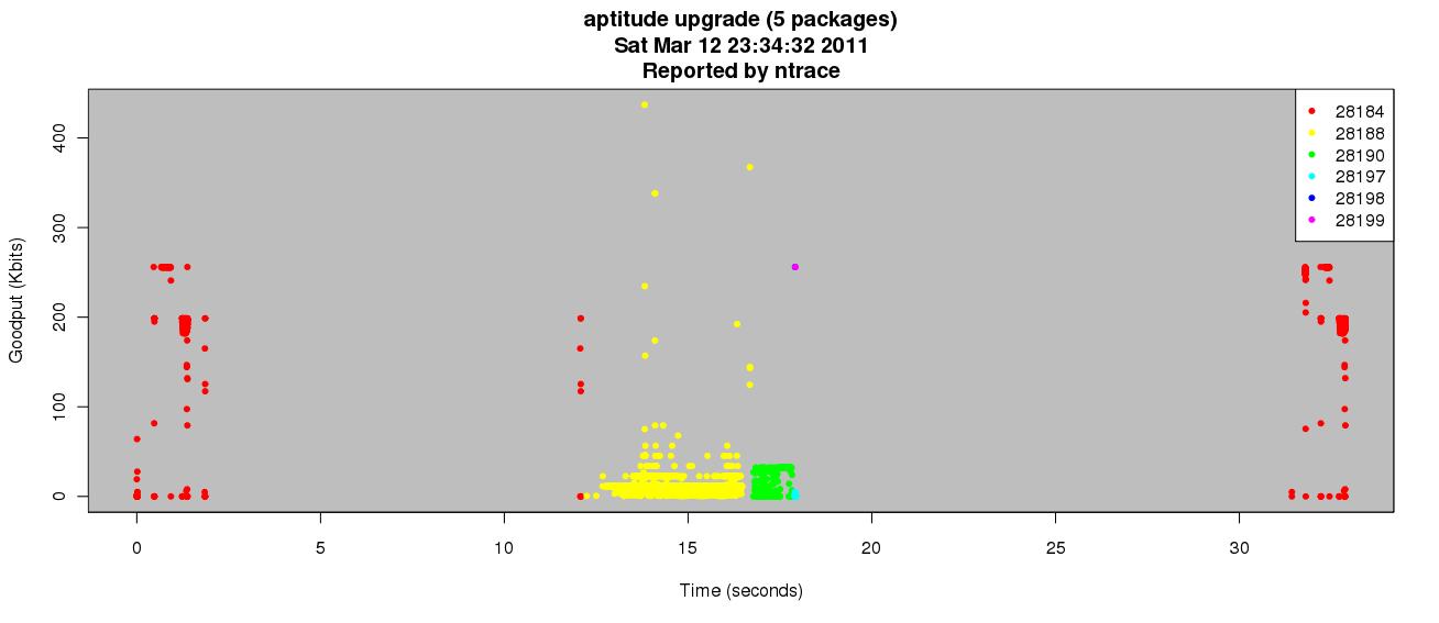
After typing Y to continue the update completed without issue. I parsed the resulting output and compiled the following graph:

Interesting points:
  • Between seconds 3 and 12 there is no activity. This is the time I was reading the screen before I confirmed and continued with the update.
  • Each package was retrieved by it's own process. The dots are color-coded according to the PID that was associated with the traffic (see the legend).
  • Packages are downloaded sequentially instead of in parallel.
  • The long delay after 17 seconds is the time it took to actually install the updates on my system. The original process then communicates some more (presumably about the status of the children) and the update exits.
  • The traffic patterns for the parent process are nearly identical at the front and back end of the communication. Maybe all details of the update are advertised at both ends instead of a diff? Dunno, but it is interesting.
This is how ntrace is useful to me: quick insight into application activity as it relates to the network.

As part of my testing I am doing performance impact analysis. Perhaps some of those details will appear here as well.